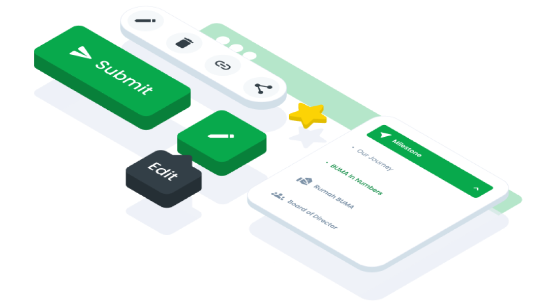
ComponentsIconIcons are graphic elements that symbolize concepts, items, or actions. They deliver information quickly, facilitate user interaction, and highlight critical details.
Guidelines
Web
Resources You can use these components by accessing the provided resource files.
Usage
The package is already installed in the repository's shell. To use the component, you only need to add the following code:
<BIcon name="person" />
Attributes
If there is a question mark ? in the Data Type, it means that the properties are optional.
| Property | Data Type | Description | Default Value |
|---|---|---|---|
| name? | string | Optional name of the item | fiber-manual-record |
| width? | string | Optional width of the item | 16 |
| color? | string | Optional color of the item | #111111 |
| size? | string``number | Optional size of the item | none |
Mobile
Resources
- You can use these components by accessing the provided resource files.
- Preview animations are examples and may not suit Mobile Widgets. Press 'View Code' to access the Widgetbook Playground and see the Flutter widget displaying all created components and interactive.
Usage
BUMA mostly uses material icons directly supported by Flutter, therefore we can directly use Flutter's built-in widgets.
Import this line to your file:
import 'package:flutter/material.dart';
Attributes
If there is a question mark ? in the Data Type.
| Properties | Data Type | Description | Default Value |
|---|---|---|---|
| icon | IconData | The icon to display | null |
| size | double? | Adjust the size of the icon | 24.0 |
| color | Color? | Set the color of the icon | Colors.black |
| semanticLabel | String? | Label for accessibility purpose | null |
| textDirection | TextDirection? | Specify text direction | TextDirection.ltr |
Code
Icon(
    Icons.favorite, // Icon name
    color: Colors.red, // Icon color
    size: 48.0, // Icon size
    semanticLabel: 'Favorite Icon', // Accessibility label
)