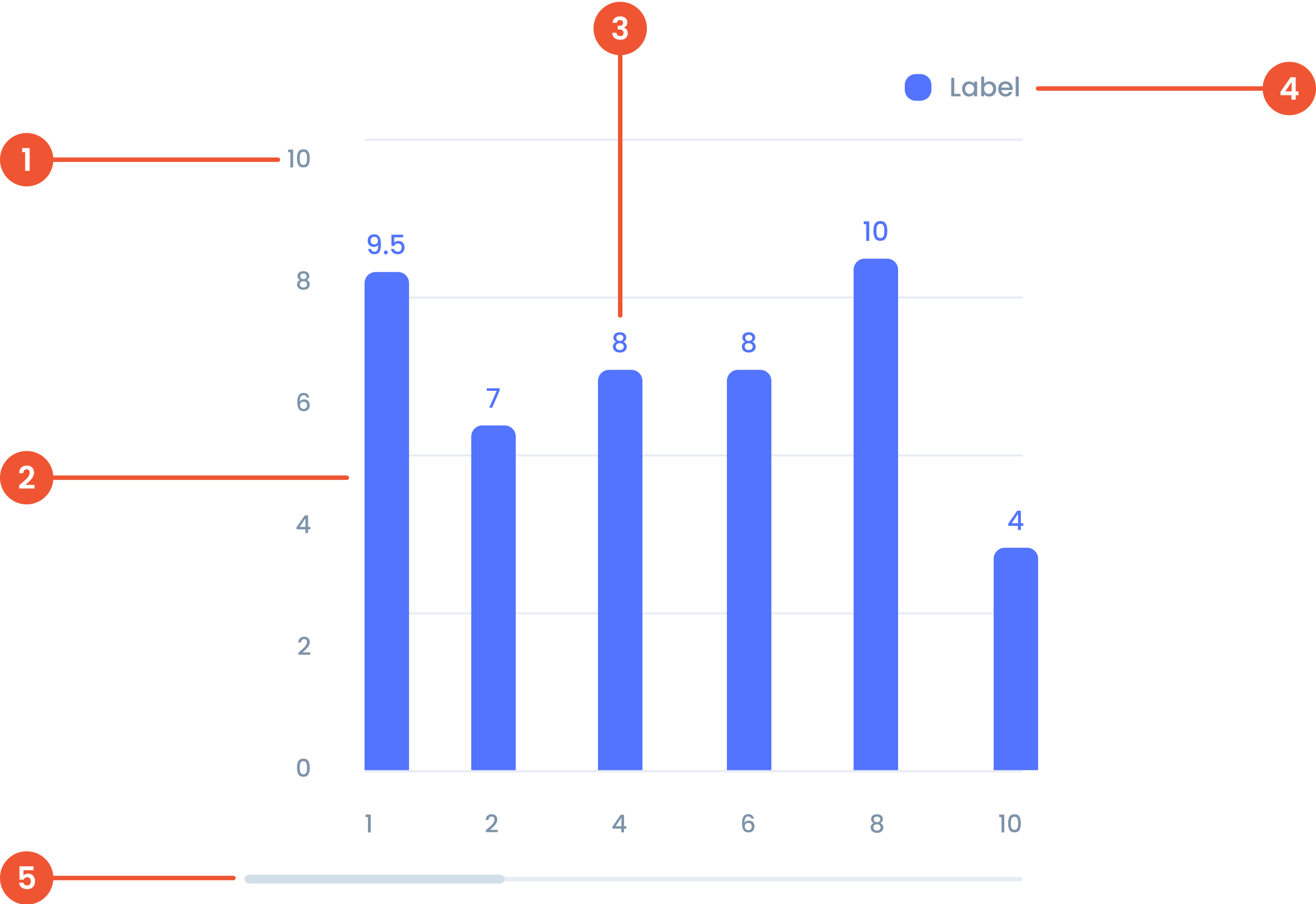
Buma UI - DocumentationBuma UI - Documentation
Get Started
Foundations
Components
Resources
Patterns
Data Visualization
Back to BSpace
Get Started
Foundations
Components
Resources
Patterns
Data Visualization
  • stacksFoundations
    • 💡 Overview
    • Color
    • Principle
    • Typography
  • brickComponents
    • 💡 Overview
    • Accordion
    • Alert
    • Avatar
    • Badge
    • Bottom Sheet
    • Bread Crumb
    • Button
    • Button Link
    • Button Navigation
    • Calendar
    • Card
    • Chat
    • Checkbox
    • Chips
    • Choice Tile
    • Comment
    • Date Picker
    • Divider
    • Download
    • Drawer
    • Dropdown
    • Empty State
    • Floating Button
    • Form Input
    • Header
    • Hint
    • Icon
    • List Choice
    • Loading
    • Modal
    • Navigation Bar
    • Notification
    • Pagination
    • Progress Bar
    • Radio Button
    • Search
    • Scrolling Bar
    • Segmented Switch
    • Side Menu
    • Side Tab
    • Slider
    • Switch
    • Tab
    • Table
    • Text Area
    • Text Input
    • Time Picker
    • Title
    • Toast
    • Tooltip
    • Wizzard
  • splitscreenPattern
    • 💡 Overview
    • Filter
      upcoming
    • Form
      upcoming
    • Notification
    • PWA
      upcoming
    • table
      upcoming
    • Upload Download
      upcoming
  • insert_chartData Visualization
    • 💡 Overview
    • Tiering
    • Pattern
    • Chart and Graph
      • Chart Selection Guide
      • Map Selector
      • Donut Chart
      • Donut Progress Bar Chart
      • Spider Chart
      • Line Chart
      • Chart Area
      • Speedometer
      • Heat Map
      • Scatter Plot
      • Pie Chart
      • Bar Chart
      • Waterfall Chart
      • Sunburst Chart
      • Tree Decomposition Chart
      • Scorecards
      • Table
      • Micro Visualization
    • Typography
    • Color Palette
  • data_objectTokens
    upcoming
  • inventory_2Resources
    • 💡 Overview
    • Mobile
      new
      • 💡 Introduction
      • Installation
      • General
        • Important Rules
        • Naming Convention
        • Clean Architecture
    • Web
      upcoming

Bar Chart

Anatomy

 The value in a bar chart represents the numerical data corresponding to each category. It determines the height or length of the bar.
 The chart bar is the visual element that represents the value. It can be horizontal or vertical depending on the orientation of the bar chart.
 The label in a bar chart is the descriptive text that identifies categories or axes. Labels provide context for the data.
 A visual elements that serve as a guide to explain the meaning of various data or elements displayed in a graph
 A bar that lets you move around the chart when there’s too much data to fit on the screen.
Guidelines for Bar Chart

  • Y-Axis and X-Axis Maximum Values: Up to 10 different values ​​on each axis for clarity.
    • Single Category: Up to 10 bars for readability.
    • Stacked Bars: Up to 5 stacked bars per category for . maintain clarity.
    • Axis Labels: Limit to under 15 characters to avoid truncation.
    • Bar Labels: Limit to 10 characters for better readability.
    • Bar Width: Make sure the bar width is consistent for all bars.
    • Spacing: Keep the same distance between bars.
    • Alignment: Bars must be properly aligned on the X-axis with the category labels below them.
    • Label: Place a label under the X-axis for each bar.
    • Bar Height: Ensure consistent bar height for all bars.
    • Spacing: Maintain equal distance between bars.
    • Alignment: Bars must be properly aligned on the Y-axis with category labels on the left side.
    • Label: Place a label to the left of the Y-axis for each bar.
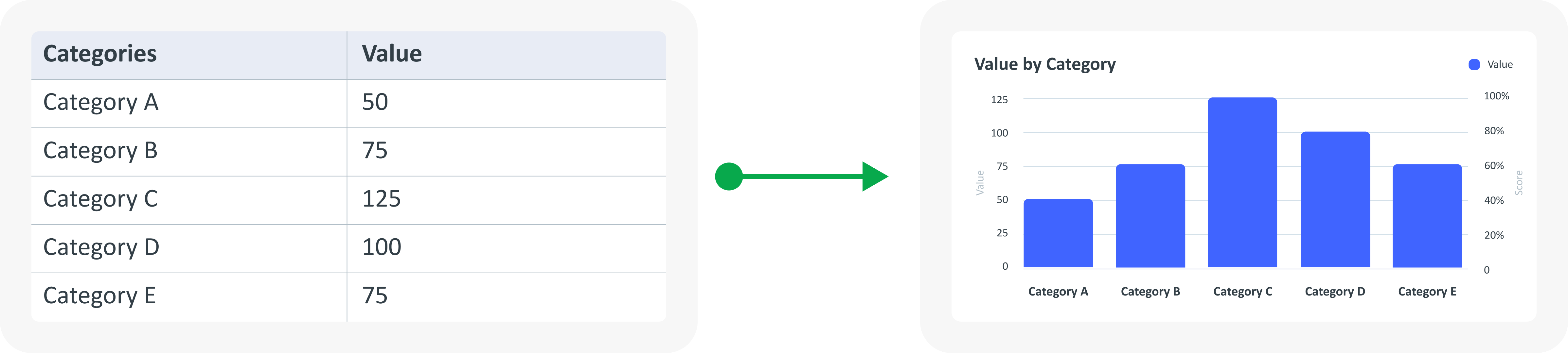
Example of Source Data

When to Use Bar Chart?
  • Comparing values ​​between different categories.
  • Ideal for comparison of categorical data.
  • Shows differences between categories.
arrow_back
Previous Pie Chart
Next Waterfall Chart
arrow_forward