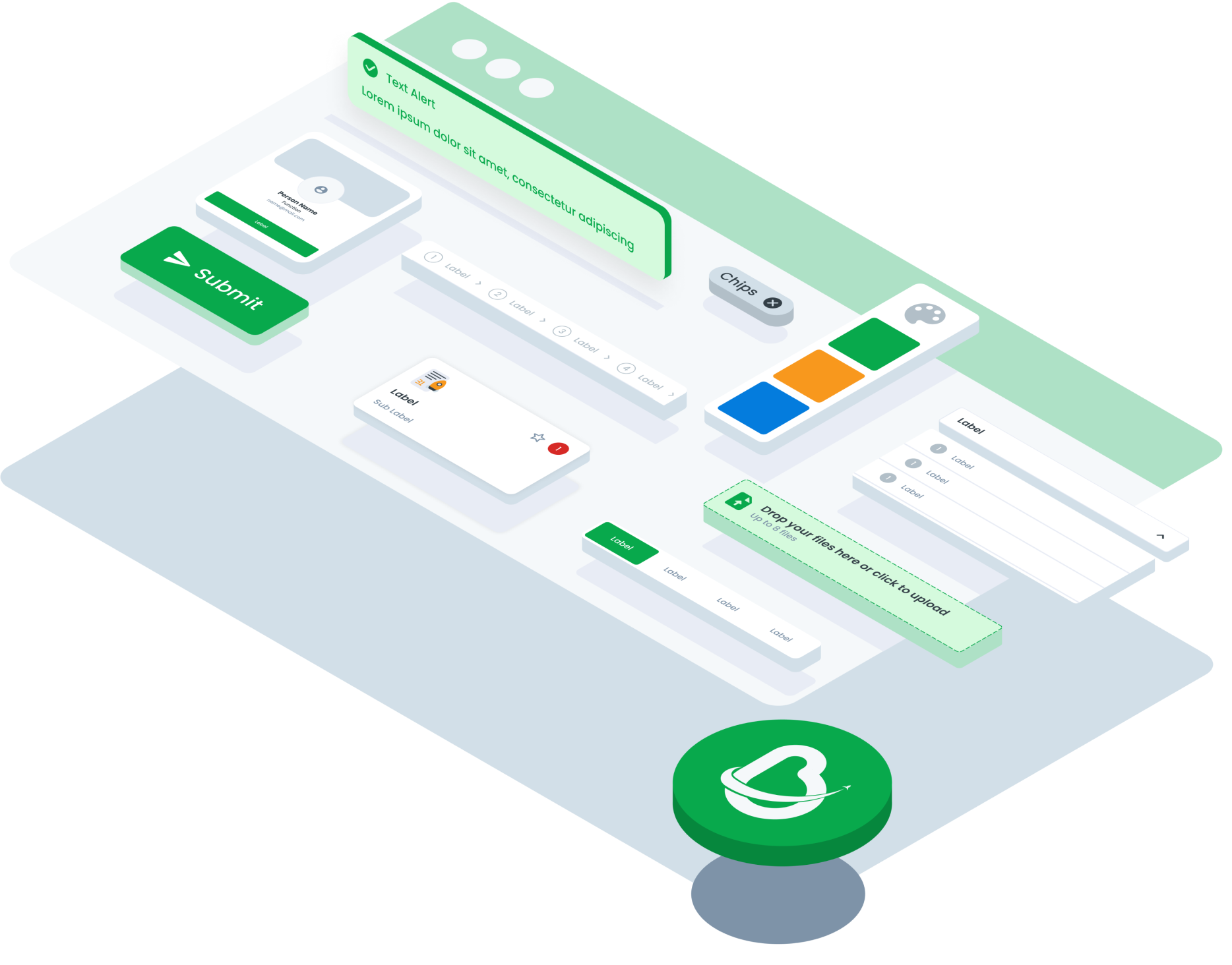
ComponentsOverviewSet of components library from multiple brand and platform

Accordion
An element that can expand/collapse to reveal or hide more.webmobile

Alert
To informing the user of important changes in a prominent way.webmobile
Avatar
Graphical interface to a visual representation of user, entity or profile.webmobile
Badge
Graphical element that is used in web or mobile interfaces to display a small piece of information.webmobile

Bottom Sheet
It is a common UI pattern used in mobile to present contextual information or interactive elements without fully covering the main content.mobile

Bread Crumb
A navigational element used to show users the location of the web page or application they are currently visiting in a hierarchy.web

Button
Is a graphical element that, when clicked or tapped, initiates an action or event in a web or mobile interface.webmobile

Button Link
Directing users to another location within the same website or to an external webpage.webmobile

Button Navigation
The Navigation Button component consists of buttons used for navigating between different pages or sections within an application or websitemobile

Calendar
Graphical element that allows users to select a specific date or range of dates from a calendar-style interface in web or mobile interfaces. It usually consists of a text input field or a button that, when clicked or tapped, opens a dropdown or popup with a calendar or list of dates.webmobile

Card
Graphical element that is used in web or mobile interfaces to present a small amount of information in a concise and visually appealing manner.webmobile

Chat
Designed to facilitate real-time communication between users within an interface, mimicking a conversation interface commonly found in messaging applications. It enables users to exchange messages, multimedia content, and interact with bots or automated systems seamlessly.web

Chips
User interface design are graphical elements used in web or mobile interfaces to display small units of information, often related to user status, activity, or notifications. They typically consist of a small rectangular or circular shape with text or icons inside.webmobile

Choice Tile
Usually small boxes or rectangles containing text, images, or icons that represent the options available to the user. It can be used in various contexts, such as menus, product lists, configuration options, or selectable actions.webmobile

Comment
A textual or symbolic annotation, note, or statement added to a piece of content, code, document, or discussion, typically for the purpose of providing additional information, explanations, opinions, or context.webmobile
Date Picker
A graphical element that allows users to select a specific date or range of dates from a calendar-style interface in web or mobile interfaces. It usually consists of a text input field or a button that, when clicked or tapped, opens a dropdown or popup with a calendar or list of dates.webmobile

Divider
A design element used to separate or divide parts of content. This helps organize the layout and improves visual clarity.webmobile

Download
Essential part of forms, providing users with the ability to download files. This component comes in two main conditions: when no attachment file is present and when an attachment file is available. Each condition has both small and large size variations to suit different design needs.webmobile

Drawer
User interface design is a panel that can be pulled out from the edge of the screen to reveal additional content or options. It's a common feature in mobile apps and responsive websites, offering a space-saving way to display secondary information or navigation menus without overwhelming the main interface. Drawers can contain settings, navigation links, or contextual actions, providing users with convenient access to relevant features without cluttering the screen permanently.web
DropDown
A dropdown is a graphical user interface (GUI) element that allows users to select an option from a list of predefined choices. It typically consists of a text input field or button that, when clicked or tapped, displays a dropdown menu with a list of options for the user to choose from. Dropdowns are commonly used in web and mobile interfaces to provide users with a convenient way to select values, make selections, or perform actions within an application or website.web
Empty State
A messages that appear whenever a page or component has no content to display to the user. They can appear anywhere across the page. They can alert users to empty search results, unconfigured features or can even appear to tell users that an empty area has been intentionally left blank. An empty state should never feel empty. An empty state is a way to communicate to users why they are seeing a page with no content to display.webmobile

Floating Button
Interface design refers to an interactive element that floats above the main content of an application or website, typically providing quick access to essential functions or frequently used actions.mobile

Form Input
Component is a crucial element in user interface design, facilitating the collection of user data within web or mobile applications. Typically, it comprises various types such as text fields, dropdown menus, checkboxes, radio buttons, and more, tailored to capture specific types of information.webmobile

Header
The header in the UI generally functions as a place for navigation, branding, and main information that is easily accessible to users. A good header design will ensure intuitive navigation and a clear identity for users.web

Hint
Component functions as a notification within a web or mobile interface, signaling the necessity of action within a particular function.web
Icon
Icon is a graphical representation of an object or concept, typically used to convey information or provide visual cues within a user interface. Icons are essential elements in web and mobile design, serving as intuitive symbols that help users navigate, interact with, and understand the content and functionality of an application or website.web

List Choice
The List Choice component offers users a selection interface presented in a list format. It provides variations to accommodate different use cases and user preferences, such as including descriptions, icons, buttons, or checkboxes within each list item.mobile

Loading
A loading component is a visual element, often a spinner, shown to users while content or features are being loaded.webmobile

Modal
Modal UI refers to a concept in UI design where a window or dialog box appears above the main content of a page or screen, typically to display additional information, gather input from the user, or request confirmation before proceeding with a specific action. Modal UI is often used to focus on a particular task or solicit direct interaction from the user without disrupting the background context. It helps create a more focused and interactive user experience.web

Navigation Bar
A navigation bar is a prominent UI element that typically appears at the top of a window or screen in digital interfaces, aiding users in navigating through a hierarchical structure of content.mobile

Notification
The Notification component is used to deliver important messages, alerts, or updates to users within an application or website.webmobile

Pagination
Pagination in interface design refers to the organization and presentation of content across multiple pages, particularly in situations where the amount of content exceeds the space available on a single page. It involves dividing content into discrete sections or pages and providing navigational controls, such as page numbers, next/previous buttons, or a 'load more' option, to allow users to move through the content sequentially.webmobile

Progress Bar
A progress bar is a graphical user interface (GUI) element or visual indicator that displays the status of an ongoing task or process, typically in the form of a horizontal bar or a similar visual representation. It provides real-time feedback to users by showing the relative completion or advancement of the task. Progress bars are often used in software applications, websites, and other digital interfaces to convey information about how much of a task has been completed and how much remains, helping users estimate the time required for completion and providing a sense of continuity and control during lengthy processes.webmobile

Search
The Component UI for Search is an intuitive and sleek interface that allows users to enter search queries, view auto-suggestions, apply filters, and browse through search results. It provides a seamless and efficient search experience, empowering users to find the information they need quickly and easily.webmobile

Scrolling Bar
A scrolling bar in interface design is a graphical element that indicates the position of content within a scrollable area, allowing users to navigate through large amounts of content that exceed the visible viewport.webmobile

Segmented Switch
Segmented switches in interface design are interactive components that allow users to toggle between multiple options or states by selecting a segment within a segmented control.webmobile

Side Menu
A side menu is a user interface element that is typically displayed on the side of a webpage or application. It usually contains a list of navigation links or options that allow users to access various parts or features of the webpage or application. The side menu can be opened and closed by clicking on a button or icon, and it can slide out from the left (for website) or right side (for PWA) of the screen.web

Side Tab
Side tabs are used to group different but related content, allowing users to navigate views without leaving the page. They always contain at least two items and one tab is active at a time. Side tab component is typically used on the Info page of a module.web

Slider
The Slider component allows users to select a value or range within a predefined range by sliding a handle along a track. It offers variations such as the Slider Base and Slider Range, each serving specific purposes based on the desired functionality and user interaction requirements.webmobile

Tab
The Component UI for Tab is a navigation element that allows users to switch between different sections or views. It displays tab headers at the top, indicating the active tab and showing corresponding content below. It simplifies content organization and enhances user navigation within an application or webpage.webmobile

Table
The Table component is a versatile UI element used to organize and present data in a structured format, making it easier for users to read, compare, and analyze information. It consists of rows and columns that display data in a tabular layout, with options for sorting, filtering, and customizing the appearance of the table to suit different use cases and design requirements.web
Text Area
The Table component is a versatile UI element used to organize and present data in a structured format, making it easier for users to read, compare, and analyze information. It consists of rows and columns that display data in a tabular layout, with options for sorting, filtering, and customizing the appearance of the table to suit different use cases and design requirements.web
Text Input
The Table component is a versatile UI element used to organize and present data in a structured format, making it easier for users to read, compare, and analyze information. It consists of rows and columns that display data in a tabular layout, with options for sorting, filtering, and customizing the appearance of the table to suit different use cases and design requirements.web
Time Picker
The Table component is a versatile UI element used to organize and present data in a structured format, making it easier for users to read, compare, and analyze information. It consists of rows and columns that display data in a tabular layout, with options for sorting, filtering, and customizing the appearance of the table to suit different use cases and design requirements.web
Title
The title component refers to a graphical element used to display a prominent heading or label within a user interface. It typically consists of text that conveys the main message or purpose of a section, page, or element within an application or website. Titles are essential for providing context, guiding user navigation, and organizing content in a clear and understandable manner.web

Toast
The Toast component is a non-intrusive notification element that briefly appears to provide users with important messages, alerts, or feedback. It offers variations to cater to different types of notifications, such as default, error, and success, with multiple size options to accommodate varying content lengths and visual preferences.web

Tooltip
A Tooltip refers to a small, informative message that appears when a user hovers over or interacts with an element such as a button, icon, or link in a user interface. The purpose of a tooltip is to provide additional context, explanation, or description about the element or component to the user.webmobile

Wizzard
The Wizard component is a user interface (UI) element that divides complex processes into sequential, manageable steps. It provides a guided experience, leading users through tasks with clear instructions and progress indicators.webmobile